

What are good names and logos?
Each new industry standards group will have to choose a name and logo. What is a good name and logo for a consortium? What is a good name and logo for an industry alliance? How to find them, design them? And a subtle but profound question: will the industry standard created by the group have the same name and logo as the organization?
I helped create the name for a couple of industry groups, often under severe time pressure. It is not really necessary to have a name before the group is founded but it helps. If you start without a name the participants will make up a descriptive name (“the near-field high data rate communication interface group”, get tired of writing the full name and switch to using the acronym (“NFHDRC”). If the group does not chose a proper name quickly they will be stuck forever with an awkward acronym.
Choosing the name for a consortium
What is a good consortium name? I usually look for the following properties
- The URL is available as a .com domain name. It is possible to use a .org domain name, but then you have to be pretty sure that the .com variant will not cause confusion.
- The name is distinctive and is easily remembered. You can test that by writing an article about the group, use the name in the article, then ask a test panel to read the article and ask them 24 hour later if they remember the name (active recognition) or can recognize the name from a list of similar names (passive recognition). Acronyms are notoriously bad. The name “Bluetooth” scores very well on this aspect.
- No undesirable associations in major languages and cultures. A Google search will help to quickly weed out the big mistakes. Subtle associations (e.g. a name that sounds like another word that has an undesirable association) can be more difficult to spot. The participants in multi-national, multi-cultural, industry group can sometimes help research possible associations quickly by mailing people in their networks.
It can be problematic to try find a name that has relevance to the topic, or a name that has a desirable association. The main problem with meaningful names it that they tend to be long or are not distinctive enough.
It is not necessary to choose a name with meaning. “Bluetooth” is again a good example, as well as Zigbee. The name “Wireless Power Consortium” is a descriptive name, with the clear disadvantage that the name is often abbreviated to “WPC”. The name “AirFuel”, chosen by the AirFuel Alliance is an example of a name with a meaningful association, with the disadvantage that it is a bit too similar to an existing trademark (“AirCharge”), and is has a probably undesirable association with “fuel air explosives”, a rather nasty bomb.
Designing the logo for a consortium
When the name for a consortium has been chosen it is time to design a logo, and branding for website and PowerPoint presentations.
What is the purpose of the logo? It is the brand of the organization, mainly for use on website and on PowerPoint presentations, or it is also meant to identify products that are compliant with the industry standard that the organization has developed, or will develop?
A logo can serve all these purposes. The distinction between the organization and its product (the technical specification) is easily lost. If, however, the industry group develops multiple incompatible standards, the use of a single logo becomes problematic. Zigbee, for example, has developed a couple of different incompatible interface standards (they call them application standards). The consequence is that two products with the Zigbee logo will not be able to communicate in a meaningful way if they happen to implement different application standards.
Organizations that create multiple different interfaces have two choices: (a) to design different logos for each interface, or (b) to use sub-logos. A sub-logo could be, for example, the main logo combined with a number that identifies the standard.
The use of sub-logos can be tempting but dangerous because they suggest compatibility that does not exist. A good (that means bad) example is the DVD-Audio logo. ![]()
DVD-Audio was a high-definition audio standard, developed by the DVD forum, but DVD-Audio discs could not play on standard DVD players that use the DVD logo.
![]()
That was very confusing. DVD Audio eventually lost the standards battle against Super Audio CD, not only because of the logo, but the use of a sub-logo added to the confusion.
If the logo will be used on products as proof of compliance with an interface standard, useful design criteria are:
- Recognizable when printed small (try print the logo at 2 mm).
- Recognizable when rotated 90 degrees and 180 degrees. The letters Z, N, H, and I, for example, are easily confused when rotated 90 degrees. Letters like d, p, M, and W have that problem when rotated 180 degrees. This will be a problem when the logo is printed on horizontal surfaces, a table for example.
- Preferable no words or letters as part of the logo.
- It must be easy to obtain trademarks in all countries worldwide. That means the design has to be unique and distinctive. It is risky to base the design on a letter. Designers have played with typography and letters for hundreds of years. When designers come up with a beautiful modification of a letter, you may find out late in the trademarking process that the same brilliant idea was used in the 1930’s for a now obscure brand.
- It should be easy to remember and recognize the logo. The same test as described for verifying the suitability of a name can be used to test the distinctiveness of the logo.
Logos that meet these requirements are, for example, the logo for the products that comply with the Bluetooth communication standard:![]()
and the logo for products that comply with the Qi wireless power standard:![]()
Case study 1: the Zhaga Consortium
The Zhaga Consortium is a collaboration between companies that creates interface specifications for LED light sources, with the aim to make these light sources interchangeable.
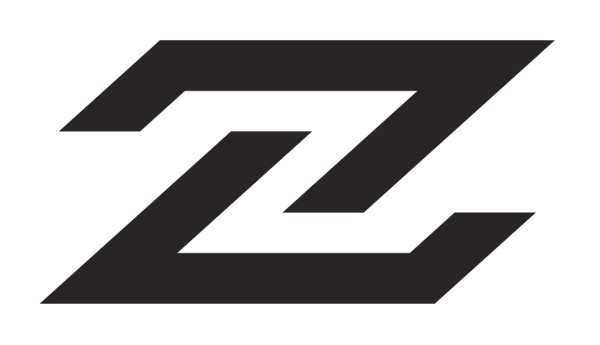
I was involved with the creation of the group and the search for a suitable consortium name. In this case we had about an hour to come up with the name because the project proposal had to be presented for a go/no-go decision and the responsible negotiator felt that his proposal needed a name, maybe a temporary name, but definitely a name. We decided to search for a meaningless code name because the obvious meaningful names led to awful acronyms. We looked at a list of waterfalls in Asia and found the name “Zhaga”. It can be pronounced, is distinctive, the Google search did not turn up undesirable websites. The only issue was that the domain name was unavailable, but used by a group that was unlikely to interfere with the goals of the consortium. The name stuck. The lack of any meaningful association worked out well.
The logo was more problematic. The first design was closely based on the letter Z, very simple, but too close to other trademarks.![]() The logo was more problematic. The first design was closely based on the letter Z, very simple, but too close to other trademarks.
The logo was more problematic. The first design was closely based on the letter Z, very simple, but too close to other trademarks.
Several re-designs were needed before it was accepted. This is the final result:

Case study 2: the design of the AirFuel Alliance logo
In a recent article in DigiDay, the branding agency Miresball talks about the design of a logo for the AirFuel Alliance. http://digiday.com/brands/one-agency-created-unifying-brand-consortium-195-different-companies/
MiresBall explains that the goal was to create a unified branding for two recently merged groups, with the expectation that members will use the logo on products.
The AirFuel Alliance developed three different, incompatible, interfaces: (1) a wireless power interface operating at 100 kHz, originally developed by the Power Matters Alliance, (2) a wireless power interface operating at 6.78 MHz, originally developed by the Alliance for Wireless Power, and (3) a far-field wireless power interface operating at 5-6 GHz. None of them compatible, although it is theoretically possible to combine them in a single product.
Interestingly, there is no hint in the article that Miresball saw the need for the logo to express compatibility. It would seem that the design priority was corporate branding more than use of the logo as mark for interoperability.
This was the result:![]() How does this design score on the criteria?
How does this design score on the criteria?
The graphical part can be recognized and printed on its own, without the letters, even when printed small. The design is still recognizable when rotated 90 or 180 degrees. That is excellent. The graphic has a detail (thin white line) that will be lost when printed small. Probably not a big issue. I have not researched for similarity with existing trademarks. The simplicity of the design (which is good) will increase the probability that there are similar designs in use. The Zhaga logo, for example.
Compare the AirFuel logo, rotated by 45 degrees,![]()
with the Zhaga logo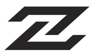
the logo of NFC Forum, rotated by 90 degrees![]()
and, of course, the logo of Z-Flex skateboards
Not the same, but surprisingly similar. This illustrates how difficult it is to make a distinctive, original, logo!
The distinctiveness of the logo is clearly an issue, but the use of the AirFuel logo on products would be my biggest concern.
The AirFuel organization developed multiple incompatible interface specifications. Which interface specification is supported by products that use this logo? If that is not clear, manufacturers of mobile phones and wireless chargers will be hesitant to use a logo that is not their own brand and does not have a meaningful message for the users of the product. And using sub logos to distinguish incompatible products is not the answer, as the DVD-Audio example shows.
Organizations that develop multiple incompatible interface specifications are advised to distinguish corporate branding (the consortium’s name and logo) from logos that are used to indicate compliance with a particular interface.
Case study 3: WinCE
Raymond Chen illustrates the problem of using acronyms and abbreviations with his blog post Embarrassing product names created: Windows CE. The name “Windows CE” became “WinCE” and sounds like “wince”. Names without any intended meaning, such as “Zhaga”, “Bluetooth”, and “Zigbee” are easier to research for embarrassing associations.
Further reading about choosing a name and logo
The article “How to develop an industry standard” explains how companies get together and establish the group that will be choosing a name and logo for their industry alliance.